Wednesday, April 3, 2013

3 Art Pieces (10th Week of April 1)

For my 3 art pieces of this week, I decided to focus on animation, as we are going to be doing a stop-motion project shortly in Design II.  I chose three animations with different purposes.  The first one is a stop-motion commercial for Beringer Wines featuring the growth of a paper vineyard.  The paper vineyard is most likely supposed to represent the vineyards that are used for the production of Beringer Wines.  The second animation is the movie title sequence and opening credits for the Pixar kid's movie Monster's Inc.  The animation is very colorful and fun, with cartoon characters that would appeal to children. Notice the use of transition and how each action leads into another.  The last one is a music video for Linkin Park's song Breaking the Habit.  It was animated with an anime-stylization that is very similar to Japanese cartoons.  This animated music video contains extremely dark and morbid references such as suicide, self-harm, drug addiction, adultery, and coronary work, which help portray the incredibly personal nature of the lyrics that are relative of Chester Bennington (lead vocalist of Linkin Park) own substance abuse struggles.

Commercial: Beringer Wines: Vineyard 45
Animated by Publicis & Hal Riney Advertisement Agency
Directed by Olivier Gondry


Movie Title Sequence: Monster's Inc.
Animated by Pixar Animation Studios
Directed by Pete Doctor


Music Video: Linkin Park, Breaking The Habit
Animated by Studio Gonzo
Directed by Joe Hahn


Sources: Wikipedia/YouTube

Tuesday, April 2, 2013

Weekly Quotation 10:

"Stay with the all unknown. 
Stay away from the hooks."

-Gimme Sympathy, Emily Haines: Canadian singer-songwriter of the indie-rock band Metric

I've always felt that these lyrics took on almost more than just words of a song and form an actual quotation by Metric's vocalist, Emily Haines.  While there is debate whether or not song lyrics can be used as quotations, I personally believe that powerful enough ones can.  I interpet what Haines is singing is that if people, especially visual and performing artists, want to achieve success, they need to be more than what society wants them to be. For example, Pablo Picasso did not become famous as an artist because he practiced realistic or impressionistic work.  No, Picasso became world-renowned because of his use of cubism and abstraction, a practice that initially received negative critical reactions.  However, because Picasso was practicing something entirely different than what people were comfortable with, he eventually became famous for his innovation and experimentation.  In order to be successful, an artist needs to push their limits of creativity, to go beyond what is expected from society, to therefore capture and intrigue their audiences. 

Sampling of Haine's Work:
Gimme Sympathy http://www.youtube.com/watch?v=LqldwoDXHKg
Breathing Underwater http://www.youtube.com/watch?v=tOpsNdv0-Is
Help I'm Alive http://www.youtube.com/watch?v=A4M068MSUpU
Black Sheep http://www.youtube.com/watch?v=ArkDWrHmmXI

Monday, April 1, 2013

Chess Piece Re-Design

My partner Brittany and I decided to completely change our chess piece design.  We plan on using white and black card stock paper as our material for the pieces and constructing them into Archimedean solids.  I went through the books Heather recommended looking through and they were extremely helpful with our decision to change our design.  We also plan to layer the shapes, to give the pieces a height difference.  Lastly, we felt that by using card stock paper it would help create a bit of unity between the base (also made of card stock) and the pieces.

List of Pieces Abstracted (Possibilities)
Pawn- Tetrahedron
Knight- Tetrahedron on top of cube
Rook- Truncated Dodecahedron on cube
Bishop- Cuboctahedron on cube
Queen- Rhombicuboctahedron on cube
King- Great Rhombicuboctahedron on cube

Flat-Packed Polyhedra
Archimedean Symmetries & Three-Dimensional Tessellations

Pictures from Platonic & Archimedean Solids by Daud Sutton.

Sunday, March 31, 2013

Research for Final Serial Plane Project (Terracycle)

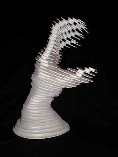
For my final serial plane project I was interested in creating a juxtaposition with the use of terracycle. I found a variety of everyday materials such as denim, laminated paper used for magazine covers, PreWrap medical tape, cardboard, and processed food bags and bottle labels (these are all glued into my sketchbook).  While researching pictures for serial planes for my second reading homework assignment, I came across these serial plane hand sculptures.  These thoroughly intrigued me, with their use of placement of the planes, the angle of them, and space surrounding the planes to create a 3D hand sculpture.  I also really enjoyed the recycled popcorn bags that we experimented with in class.  I think juxtaposition helps a piece to be very successful if it is balanced right.  For this piece, I had the idea of creating a hand made entirely out of serial planes with the actual hand in an upward cupping motion.  The juxtaposition (and terracycle) is applied on the actual materials being used.  For the planes, I am using recycled cardboard as well as recycled Smartfood popcorn bags.  The apple that will be held up in the hand will be constructed also out of recycled cardboard but with glued on laminated paper (simulated texture of an apple touch-wise).

Reference Picture #1
Front View
Reference Picture #2
Side View
Reference Picture #3
Posterior View
Reference Picture #4
Hand holding apple
 Reference Picture #5
Hand holding apple

Friday, March 29, 2013

Artist of the Week (Week 9 of March 25)

Liu Bolin

Liu Bolin is a Chinese artist known for his work in camouflage art (also known as "invisible art").  His work burst onto the art scene in 2007 and was dubbed as "advanced camouflage work."  Almost all of his pieces show him being seamlessly blended into whatever elaborate background he has chosen.  To produce his work, him and two assistants spend hours painting directly onto his clothes and body.  They then place him into the perfect position to disappear into the backdrop.  Bolin has noted that this line of work was the result of the Chinese government closing his place of employment, the Suoija Village Art Campus, and him deciding to find his own path.  Below are images from his new project Hiding in the City that is being feautured at the Eli Klein Gallery in New York City.

Sources:

Tuesday, March 26, 2013

Weekly Quotation 9:

"The beautiful is always bizarre."

-Charles Baudelaire: French poet, essayist, art critic, and translator


This quotation initially caught my attention with its short, yet powerful message. At first reading, it sounds like Baudelaire is saying that everything that is beautiful is unusual.  However, after thinking further I think he is referencing to how things that people find beautiful are uncommon, because whatever is beautiful doesn't show up enough in their life. For instance, people all have different attractions to art. If all art in the world were aesthetically pleasing to everyone, then people would more likely find unappealing art in the visual sense more intriguing because it would be different, out of place, and interesting. My interpretation of Baudelaire's quotation is ultimately that beauty is relative to the viewer, therefore those who do not find whatever the viewer finds beautiful, act as a as a balanced counterpart. This balance acts as a way to make the beauty even more beautiful to the viewer.

Sampling of Baudelaire's Work:
La Fanfarlo (1847)
Les Fleurs du Mal (1857)
Les Paradis Artificiels (1860)